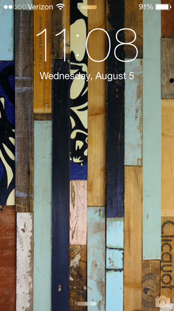
Recently, art director Adam Ladd found himself wondering, How much of a designer’s interests and personality is revealed when looking at their smartphone screens? Given that there is an incredible number of mobile apps in existence today, an infinite number of images at our disposal for backgrounds, and limitless customization options for the design savvy, the HOW team was willing to bet you could learn quite a bit about a designer by looking at his or her smartphone screens.
Too curious to go on simply wondering and betting, we reached out to a handful of designers we know and love and asked them to take a screenshot, swipe, and then take some more screenshots. Below, you’ll find the results of our little experiment—Aaron Draplin‘s “out-there” lock screen, Khoi Vinh’s landscape mode, Matteo Bologna‘s backgrounds (“boring,” he calls them), Debbie Millman‘s puppy-themed screens, Alex Griendling’s “dumb phone” and more. Some of the featured designers have intriguing apps, some have interesting backgrounds, and some are not what we were expecting at all.
Take a peek for yourself and let us know in the comments what insights you’re finding here—and which designer has screens most like yours!
Aaron Draplin’s Celestial Screens
Read more about Draplin in this recent interview.
Alex Griendling’s “Dumb Phone”
“I actually only have an iPod touch that I use almost exclusively to listen to music, and occasionally use to test apps I work on,” Griendling says. “So, since I don’t have a smart phone, [here’s] a photo of my dumb phone’s home screen. It’s nothing fancy, but it’s a phone, which I decided was all I actually needed for day-to-day life.”
Dan Gibson’s Smile-Inducing Screens
“I think you can tell a lot about a person, their personality, and their vocation by their Home Screens,” Gibson says.
About Gibson: Creative Director at Archrival.
Dan Hon’s Mobile Modifications
About Hon: Dan Hon is Director of Content at Code for America. Don’t miss seeing Hon at HOW Interactive Design Conference in Chicago, Oct. 5–7, where he’ll present a case study titled “Coding for American: Delivering Government that Works in the 21st Century.”

Debbie Millman’s “Best Friend” Backgrounds
Don’t miss the Design Heroes Premier Collection: Glaser, Millman, Kidd & Bologna.
Fredrik Öst’s Assortment of Apps
About Öst: Creative Director and Founder of Snask, an internationally renowned creative agency.
Hannah Paramore’s Sweet Screens
President of Paramore Digital. Read more about here here.
Joel Beukelman’s iOS and Android Screens
About Beukelman: He is currently a UX Designer on Android at Google, and has previously designed at Netflix & AppStack. Read more about him here. And don’t miss seeing Beukelman at HOW Interactive Design Conference in San Francisco, where he’ll present “Your Bias is Bullsh*t.” Register by Aug. 20 to save $200!
Khoi Vinh’s Landscape-Mode Look

Read what Vinh has to say about Betaworks #Homescreen app and an idea he has for “a very interesting app to be made from mobile screen shots—an app that could produce a powerful design reference that we don’t have today.”
About Vinh: Khoi is currently Vice President of User Experience at Wildcard and co-founder of Kidpost.
Matteo Bologna’s “Boring” Backgrounds
“I know I’m boring,” Bologna says. “I use the standard Google backgrounds because I hate to personalize my phone with family picts, kids, girlfriends, and sh*t like that.”
About Bologna: Matteo is the founding partner and creative director of Mucca Design. Don’t miss the Design Heroes Premier Collection: Glaser, Millman, Kidd & Bologna.
Michael Nielsen’s Tight Ship

“I feel like people go way overboard with folders and aesthetics with their app icons, but I run a tight ship, pretty plain and practical but highlighting the necessities such as pizza, space, numbers help, music, colors and images,” Nielsen says. “The only folder I have might as well be the trashcan.”
About Nielsen: Designer at Archrival.
Sean Klassen’s Screenshots
About Klassen: Founder of a creative studio in Denver called Legwork.
Do your best ideas come up when you’re sitting at your desk? Neither do ours.
That’s why you need to be ready for those times when your mind is clear and your best ideas flow freely. From Aaron Draplin comes the Field Notes Mixed 3-Pack to help you get your ideas down no matter when or where they strike. This three-pack of pocket-sized Field Notes includes one graph, one ruled, and one plain paper notebook, each with 48 pages and a craft paper cover. You never know when you’ll feel inspired, so tuck these handy notebooks in your back pocket and you’ll be ready to jot down your million dollar ideas on-the-go.


It’s a very learning, informative post in a great website to learn and know all about the design and its also nice to get the new touch and I fell good to view this site.
Awesome! Designing is an art. Every one don’t know about this art. Great work.