Laying deep inside the creative brain, poster making ideas are sometimes hard to unhatch. Former Target creative director and poster maker extraordinaire, Allan Peters, tells us his top 10 tips for ideation and creation.
My name is Allan Peters. I went to art college because I wanted to draw every day for living. I didn’t want to design annual reports or apps, I wanted to fill galleries with work that people wanted to hang in their living rooms. I also didn’t want to just make pretty work; I wanted to make work that was provocative, work that made your brain happy as well as your eyes.
Over the years, I fell in love with poster design, and I’ve won pretty much every award on the planet doing it. I’ve learned quite a bit along the way, and I want to share a few poster design tips for anyone getting into this field. If you have a tip to add, I invite you to leave it in the comments below.
1. Start with a Good Idea
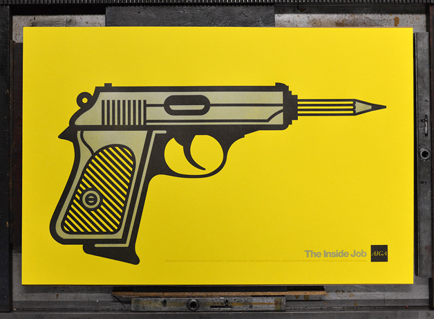
A great poster isn’t about a great aesthetic, it’s about a clever idea that’s skinned with a great aesthetic. Start out with a sketch, not on Pinterest. Start by filling a few pages with ideas. Once you have one you love, then start to think about the aesthetic of the illustration or lettering. The idea should drive the visual, not the other way around. In the example above, I was designing a poster for a creative conference called the Inside Job. I first decided that I wanted to design a pencil/gun, then I decided to illustrate it with a mono-weight black stroke to help combine the visual language of the pencil and the gun.
2. Two in One
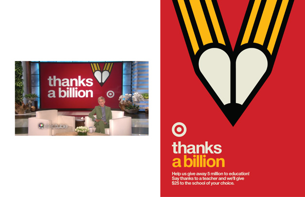
Sometimes I start with a word list. I list out nouns that evoke the message of the poster. Once I have my list, I start to combine them visually through sketches. In the poster above, the two words were “pencil” and “heart.” The message of the poster was that Target loves education. A poster of just a pencil or just a heart would be trite and pretty expected. The combination of the two elements creates something unique and ownable.
3. Get Inspired by your Life
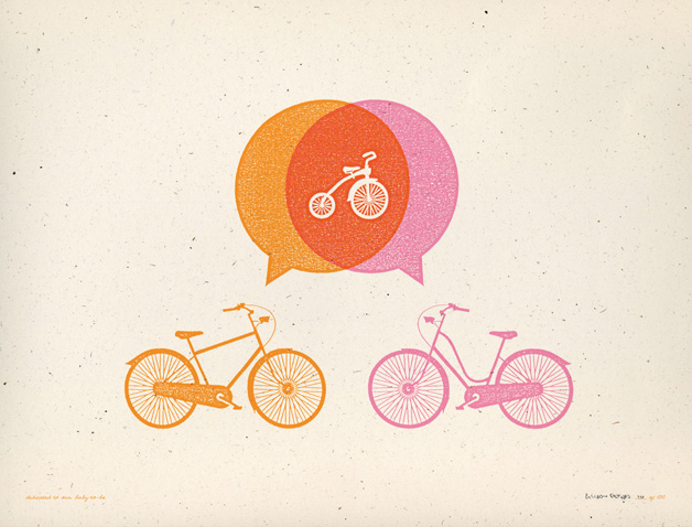
In 2009 my wife was pregnant with our first child. At the same time, I was asked to design a poster for the poster show Artcrank. The only rule about Artcrank is that the poster needs to be focused on bikes. I combined bikes and babies in this print that plays off of gender-specific bicycles.
4. Embrace the Medium
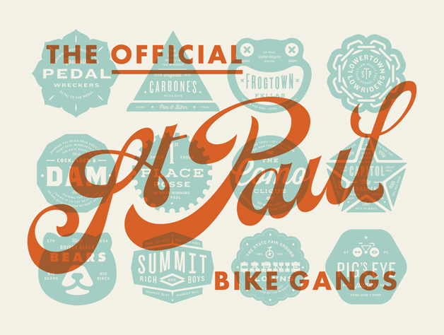
If you’re screen-printing, consider overprinting. It’s a great technique that can score you an extra color without the cost. If you’re working with digital prints, explore the possibilities. Many screen-printers look down on digital printing when in fact it’s a great opportunity to integrate photography and subtle shading. If you’re doing a letterpress print, make sure you explore different papers that offer a deep impression as well as the level of natural paper texture.
5. Use your Hands
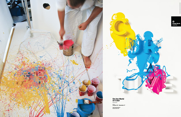
Try thinking—and working—away from the computer. Figure out the best way to execute your idea, and if that means sculpting 3D type and pouring paint on it, do it. The natural imperfection that come with handcraft can amplify an idea that needs a level of humanity.
6. Rule of Fives
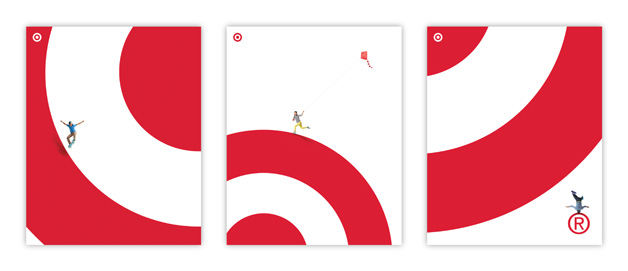
A wise man once told me that a good poster should be just as impactful at 50 feet as it is at 5 feet—and at 5 inches. In the example above, the posters read Target from +50 feet away. At 5 feet you notice the tiny person playing on the logo. At 5 inches you notice the emotion of the model as well as their striking wardrobe.
7. Embrace the Brand
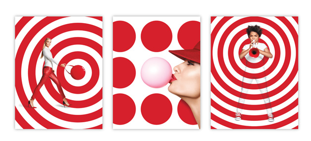 When creating a poster for brand campaign, dissect the brand’s logo and explore what you can use as building blocks in your design. Integrating the logo elements will make your poster ownable and will avoid a client asking you to make the logo bigger. In the above posters for Target, I created patterns with the dot and the ring of the Target logo and integrated the diverse target audience in this branded world. These posters are distinctly Target and read Target at a glance without ever actually showing a Target logo.
8. Explore Scale
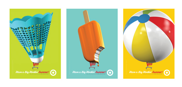
Sometimes exploring the extremes of scale can add interest to an otherwise dull image. In these posters designed for a Summer campaign, I’m only showing a cart and a product; however, the scale of the product paired with the headline adds visual interest.
9. Stand Out
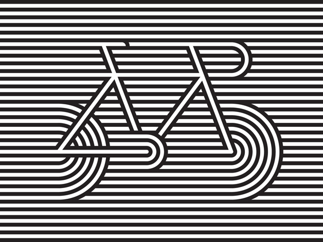
If you know your poster is going to be in a sea of posters by other designers, it’s ideal to make yours stand out. You can do this with bright color, pattern or high contrast. I’ve even seen people integrate small blinking lights into their prints.
In the Artcrank poster above, I integrated retina-burning black and white lines with a bicycle to portray speed as well as a way to highlight the bicycle’s linear frame design. This helped the posters stand out at the show as well as in Instagram feeds.
10. Keep it simple
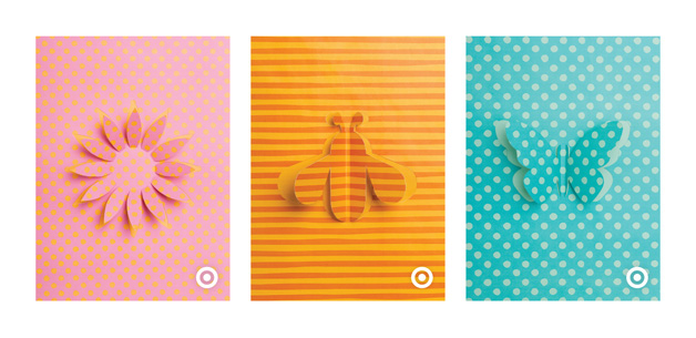
The most important tip that I can’t stress enough is to keep your poster design simple. Pick one idea and execute it with the fewest elements possible without losing the integrity of your idea. People are bombarded with visuals all day that are fighting for their attention. Make sure your poster is easily digestible at a glance. You shouldn’t have to explain the concept to anyone.
The poster series highlighted here is for Target’s Spring campaign. I picked a collection of icons that read Spring at a glance, and I illustrated them using only an Exacto knife and one piece of paper each. The simple illustration style is what makes them unique and interesting.
Thanks for reading. If you ever have any questions about poster design or branding, feel free to reach out to me on Twitter at @allanpeters. If you’d like to see more of my work, check out allanpeters.com.
For more on posters and poster making ideas, head here and here!


